
While I have discussed thin upstrokes in previous blog posts and videos, I’ve gotten a lot more questions recently about thin upstrokes on my blog, on Instagram, and my YouTube channel. Many of you have asked me for tips on improving the thin upstroke, why your thin upstrokes do not seem thin enough, and how to avoid shakiness when creating them.
Understanding how thin strokes are created and used in conjunction with thicker strokes will enable you to create basic strokes, letters, and eventually words. The challenging part about creating thin strokes is the transition to (and from) thick strokes. Before we get to those transitions, let’s talk about thin upstrokes in a bit more detail and then discuss some ways to improve your thin upstrokes.
Read more about basic strokes and connecting basic strokes.
WHAT ARE THIN UPSTROKES?
A thin line that is drawn in an upward direction with very light pressure. The stroke is thin in width and contrasts significantly from the thick downstroke. On the other hand, the thick downstroke is created using heavy pressure so that the brush pen creates a stroke that is very thick in width.
In each the following basic strokes, the thin upstroke is highlighted in yellow:

How to create thin upstrokes
First, be sure that you are holding your pen properly and pointing it in the right direction. Your grip of the brush pen and positioning make all the difference when creating your strokes.
Read more about holding the brush pen properly and pointing the brush pen in the right direction.
Then, using light pressure, draw a line upwards from the baseline. You can either end at the waistline or ascender line. The idea is that the stroke is thin in width and is created with an upwards motion.

Characteristics of thin upstrokes
The thin upstroke should contain the following features:
- Thin (or relatively small) width, especially in comparison with thicker strokes
- Usually the thinnest width of a stroke that a brush pen can create
- Consistent width throughout the entire stroke (not including the transition to/from a thicker stroke)
- Created by drawing stroke in an upward direction (although not required)
- Does not have to be the size of an actual “hairline” – depends on your brush pen
As you practice your thin upstrokes, pay attention to these features above. If you find any challenges, try the following tips and suggestions to improve your thin upstroke.
Improving thin upstrokes
It can be tricky maintaining a thin upstroke because you need to use a lot of steady control and go slow. But it is doable! If I could go back in time, I would tell my beginner self to not worry about shakiness. To this day (after over a year of brush calligraphy experience), I still find myself shaky every so often. What is more important than not having any shakiness is mastering good letterforms and rhythm.
- Understand how the thin upstroke is created and what characteristics it should have (see previous sections above)
- Go slow and do not worry about shakiness: It is more important in the beginning to build muscle memory for good letterforms and rhythm. The shakiness will improve the more you practice, gain familiarity with a pen, and find what works for you. Shakiness is sometimes also a function of being relaxed or
- Try different brush pens: Not all brush pens were created equal! The width of a thin stroke depends on the size, flexibility, and stiffness of your pen.
- Practice makes progress: As always, strive for progress, not perfection. The human hand is incapable of perfection, so don’t worry if your strokes do not look flawless. Instead, focus on the tips above, and on consistency.

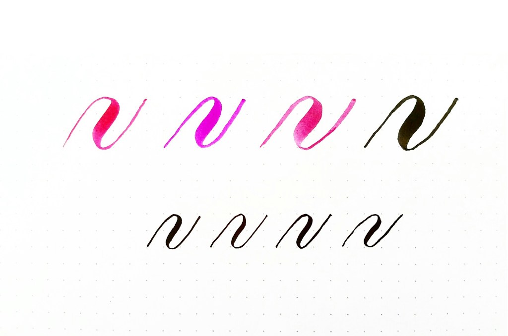
Pens used from right to left, top to bottom:
- Tombow dual brush pen
- Koi coloring brush
- Sakura Pigma brush
- Pigma professional brush in bold
- Tombow Fudenosuke hard tip
- Tombow F
udenosuke soft tip - Pentel sign pen with a brush tip
- Pigma professional brush in fine
~ ~ ~
Video: Tips for improving thin upstrokes
In the following video, I review the core concepts in this blog post and demonstrate how you can implement them in your own practice.
~ ~ ~
It’s your turn! Tell me in a comment below:
With thin upstrokes, what are you struggling with the most?
What questions do you have about creating thin upstrokes?
What tips can you add and share about improving thin upstrokes?
~ ~ ~
P.S. If you liked this post, please share it with a friend!
P. P. S. If you haven’t already done so, subscribe to my blog below so you get my posts directly in your inbox!
Follow me on Instagram: @piecescalligraphy
And now on Periscope! Find me at @piecescalligraphy
~ ~ ~
Supplies used:
- Tombow dual brush pen
- Koi coloring brush
- Sakura Pigma brush
- Pigma professional brush in bold
- Tombow Fudenosuke hard tip
- Tombow Fudenosuke soft tip
- Pentel sign pen with a brush tip
- Pigma professional brush in fine
- Rhodia dot pad (Amazon/Paper and Ink Arts)
For more supplies, visit my supplies page.

Leave a Comment